Gravie Mobile App
Empowering On-the-Go Insurance Access
Project Overview
Company
Gravie
My Role
Lead UX Designer conducting UX research.
The Challenge
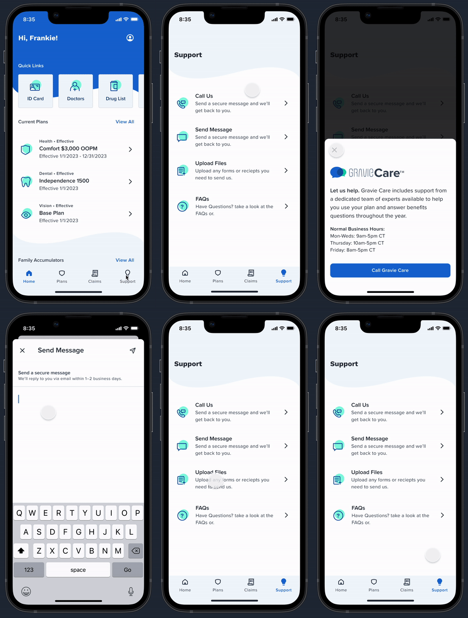
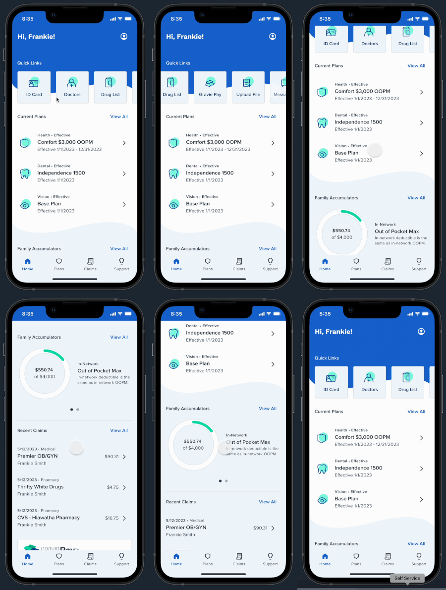
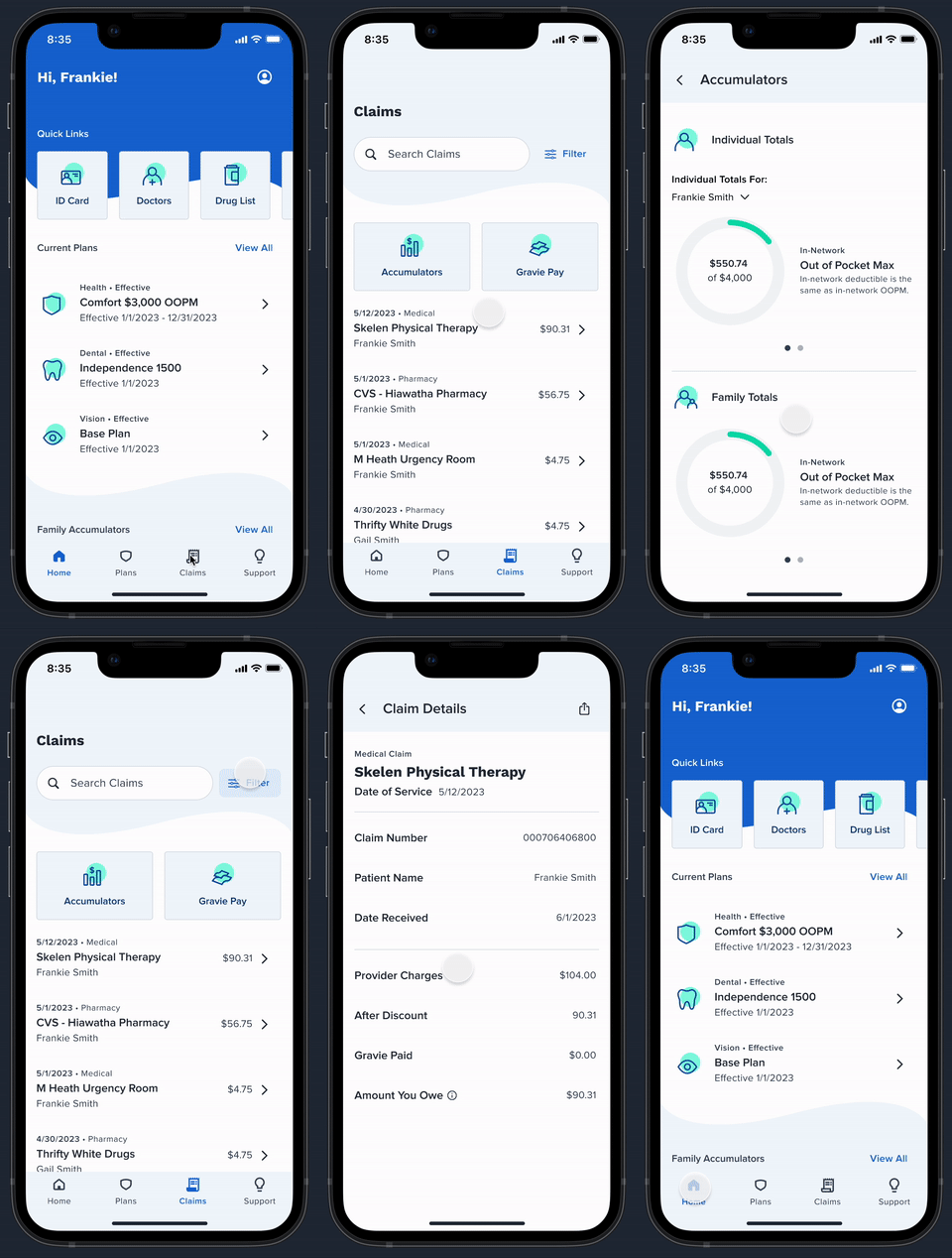
Our customers were increasingly mobile, but their insurance information was stuck on the website, which wasn't mobile-friendly. This caused an increase in customer support calls and frustration among our customers. The business saw the need to translate the complex web platform into an intuitive mobile experience.
The Journey
Discovery Through Collaboration
I established a rapid but thorough discovery phase with the mobile product team. Our UI designer and I spent hours whiteboarding user flows while engineering team members provided insights into technical constraints and opportunities. Together, we weren't just designing an app but reimagining how people interact with their insurance.
Deep Dive into User Needs
I designed a comprehensive research plan to give us the depth and breadth of insights needed.
Unmoderated tests using the UserZoom Go platform and their participant panel
A carefully curated set of tasks that mimicked real-world scenarios
A mix of open-ended exploration and directed tasks
As I watched hours of user testing videos, patterns emerged. Overall, the test results were good. All ten participants indicated they were likely or very likely to use the app if Gravie was their provider. As one user put it, "It's very helpful that I'm able to navigate throughout and find exactly what I need without having to do too much."
However, we did find areas to improve. One participant spent nearly 20 minutes looking for information that should have been readily available. Another expressed frustration with industry jargon, noting that terms like "accumulator" felt alienating. These moments weren't just data points but opportunities for the company to make insurance more accessible and make a real difference.
From Insight to Implementation
Armed with user insights, our team moved into high gear. I worked hand-in-hand with our UI designer to translate research findings so they could update the visual designs. Engineering teammates joined our daily stand-ups, ensuring our designs weren't just beautiful and buildable. When we hit roadblocks, our project manager facilitated problem-solving sessions that kept us moving forward.
The Bigger Picture
This project wasn't just about building an app—it was about making insurance more accessible, one tap at a time. By combining rigorous user research, collaborative design thinking, and a relentless focus on user needs, we created an experience that will transform how people interact with their insurance benefits.


